CI
- Check out the CI of Samkwang containing dynamic and passionate energy.
-
BI
- Check out the design containing the Identity of each brand.
-
-
-
-
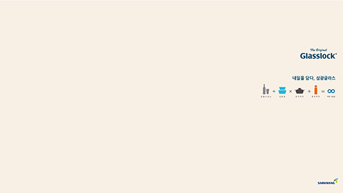
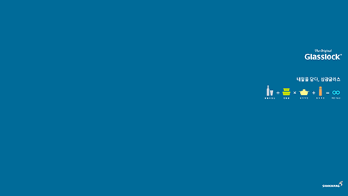
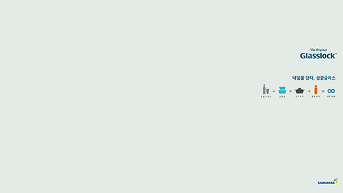
WALLPAPER
-
BEIGE PINK
-
CADET BLUE
-
MIST GREEN
IDENTITY
- The overall shape has a feel of dynamically flying curve forming 'S' which is the initial of Samkwang. The logotype is combined with capital letters expresses the regal status and credibility as a leader in the future.
-
-
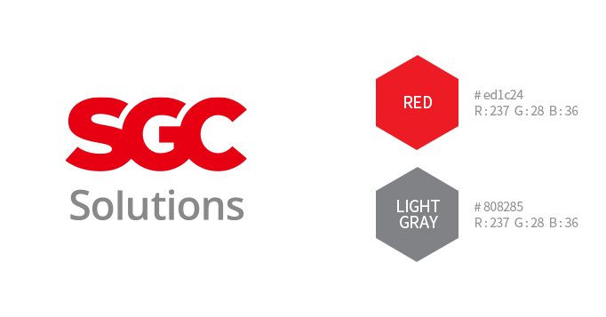
COLOR PALETE
- Everlasting Innovation motif represents the dynamic and passionate energy of Samkwang that takes a leap towards future.
Color with a feel of transparent overlapping reflects futuristic design trend, and Blue and Green, Navy Blue are used as CI color to represent the image as a leader in the eco-friendly industry.
-
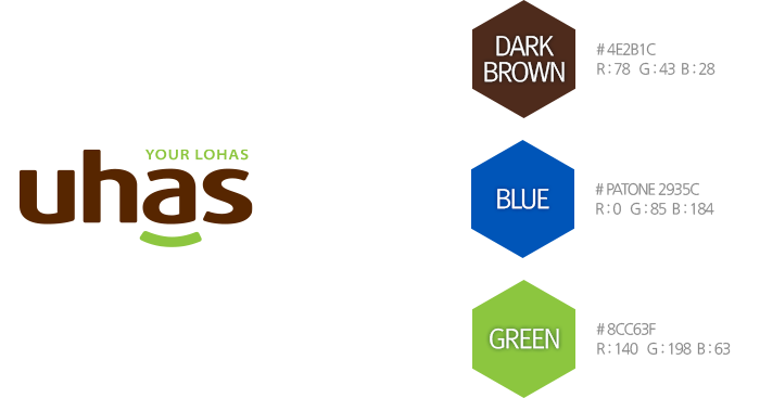
uhas IDENTITY
- BI of family brand 'uhas' that encompasses the individual brands of Samkwang is based on the concept of 'Healthy smile in everyday life'.
Smile motif beneath ‘a' is Design Essence, expressing the status of corporate brand as a leader in the environmentally friendly industry and user-friendly corporate image.
-
-
COLOR PALETE
- Luxurious and stylish Dark Brown used as main color transmit the comfortable feeling of the nature. This with depth gives a luxurious, yet sincere and warm feeling.
In addition, harmony in Green color expresses the image of a leading eco-friendly company.
-
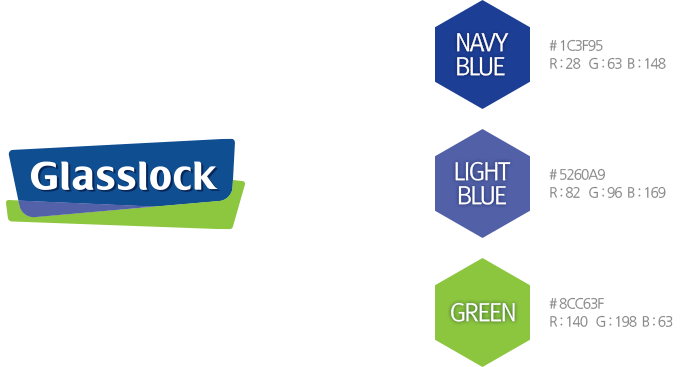
Glasslock IDENTITY
- BI concept of global leading airtight glass container brand Galsslock visualizes the robustness and transparency, the purity and freshness of the life.
Frame of Glasslock which has an impact is bonded with glassware asymmetrically symbolizes the safety of glass material and healthy and environmentally friendly lifestyle.
In addition, the logotype of Glasslock in which capital letters and small letters are combined features excellent readability and the gentle curved elements added to the edge of letters expresses a feel of stylish Glassware.
-
-
COLOR PALETE
- Main color is one of the important elements forming the identity of Glasslock together with the brand logo.
Spot color printing is the principle for the expression of main color, using Pantone Color and RGB Color as standard.
In the case of newspaper and magazines using 4 primary colors, spot printing is impossible. So the regulation of the use of 4 primary colors below shall apply.
-
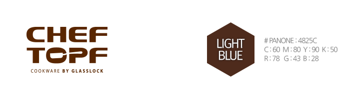
CHEF TOPF IDENTITY
- CHEF TOPF BI with refined and sizeable acoustic experience transmits professional and modern image, and reflect pleasant and playful lifestyle adding repeated rhyme.
The concept of CHEF TOPF BI uses the silhouette of 'Smart Multi Kitchen Lifestyle' as Design Essence, to make the product category be easily recognized by consumers.
The logotype combined with robust and wide capital letters gives a feel of safety, and curved elements added to letter give a feeling of friendly and easy-to-use.
-
COLOR PALETE
- Main color is one of the important elements forming the identity of CHEF TOPF together with the brand logo.
Spot color printing is the principle for the expression of main color, using Pantone Color below as standard.
In the case of newspaper and magazines using 4 primary colors, spot printing is impossible. So the regulation of the use of 4 primary colors below shall apply.
-
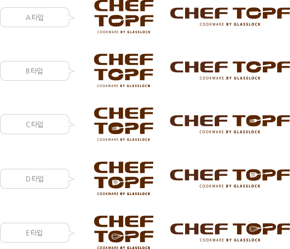
Extension Logo
- The extension logo of CHEF TOPF was developed on the basis of various design essences in various forms so that the image of CHEF TOPF can be used in ads with more options.
In the event the forms other than the forms specified in this guideline are used, Look and Feel of Design Essene shall be applied to the development of such forms.
If it is difficult to make a judgment, please consult with the brand management department.
-
outtro IDENTITY
- With regard to the spelling of outtro, 'o' is repeated at the start and the end, and 't' is repeated in the middle, showing symmetry.
This feature is used in design. Alphabet 'o' expresses the form of stretched wings beating the wind and the dynamic Italic fonts added to the logo express the dynamics of outdoor brand and 'freedom from urban life'.
Sky Blue color expresses a refreshing feeling of the nature.
-
COLOR PALETE
- Main color is one of the important elements forming the identity of outtro together with the brand logo.
It functions to transmit the image of outtro when applied to various visual media.
Spot color printing is the principle for the expression of main color, using Pantone Color and RGB Color below as standard.
In the case of newspaper and magazines using 4 primary colors, spot printing is impossible. So the regulation of the use of 4 primary colors below shall apply.
-
YumYum IDENTITY
- YumYum embodies a smiling look of healthy children, so it make children feel familiar to it and reflect the image of cute children.
The spelling of YumYum brand was developed using capital letter and small letters symmetrically in such a way as to make it feel fun and safety at the same time.
Due to the rugged but gentle curve conveys a feeling of comfort to the child and the parent.
Color identity will pass by YumYum Smile Skyblue cozy and chic colors.
-
COLOR PALETE
- Main color is one of the important elements forming the identity of YumYum together with the brand logo.
It functions to transmit the image of YumYum when applied to various visual media.
Spot color printing is the principle for the expression of main color, using Pantone Color and RGB Color below as standard.
In the case of newspaper and magazines using 4 primary colors, spot printing is impossible. So the regulation of the use of 4 primary colors below shall apply.
-